The logo is an essential part of the business. It has significant importance in reaching the customers. It has great importance when it comes to marketing. It’s one of the highest observed elements of the brand.
A well-designed logo power to distinguish your brand from others. It’s an identity of the brand. Generally, people would recognize brands just because of the alluring logo. Sometimes by looking at the crop of it people would interpret the name of the brand. This is called the perfectly designed professional logo design.
Visual elements are always easy to recall even for a longer time. That’s why companies are investing a lot of money in it to make it unique and appealing. However, at the same time, it must hold the personality of the brand as well after all it’s a mirror of the company.
Furthermore, today adding some meaning in the logo is popular among designers. For that designer must have a creative mind to make the perfect use of design elements to make it meaningful. The logo design company with hidden meaning always remains interesting and eye-catching. So, let’s discuss some of the popular logos with hidden meanings.
1. FedEx

FedEx is an American multinational delivery service company. When it comes to custom logos with hidden meaning then this would be the first name that comes into everyone’s mind. They have perfectly illustrated the brand role in the logo.
In the first attempt, you might not be able to identify what the logo includes. But when you carefully observe it then you come to know that the space between the letter E and X makes the straightforward arrow. Being a courier delivery company, it’s a perfect message that they must convey.
2. Cisco
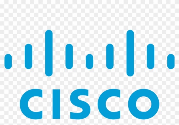
Cisco is one of the biggest networking hardware companies based in San Jose, California. It manufactures and sells networking hardware, telecommunication equipment. Along with that, they are quite popular with their custom logo as well.
It seems like the logo only consists of blue strips and electromagnets but the fact is that it’s a design of the popular Golden Gate Bridge in California. The designer has implemented it very nicely. This way they are able to capture the attention of the people and make a unique brand identity.
3. Amazon
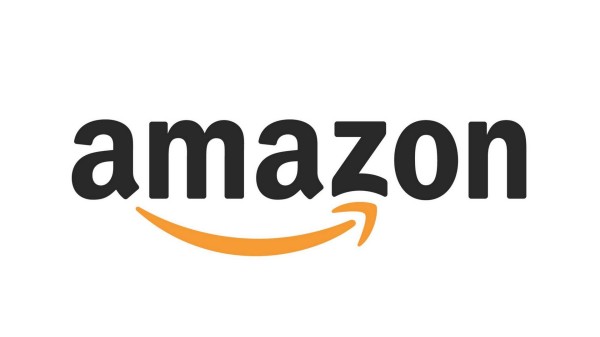
One of the most popular eCommerce companies and everyone is aware of it. Similarly, when it comes to logo design they have set an example of what you can do to illustrate the brand value in it.
The yellow arrow goes from the letter A to Z shows that they have every product starting from A to Z from the single store. Moreover, that yellow arrow makes a smile which they assure customers will experience after purchasing the product in their store.
4. Baskin Robbins
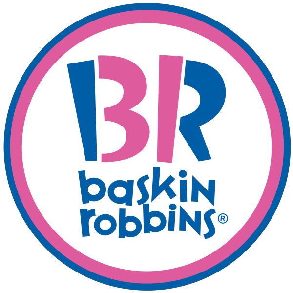
Baskin Robbins is famous for the wide range of flavors in the ice cream. The idea has been implemented in the professional logo design as well. At first attempt, it seems like the first letter of the brand but the pink letter indicates the 31. Which is the flavor of ice cream they offer, new every day throughout the month.
5. Toyota
Toyota is a Japanese multinational automotive manufacturer. It’s popular across the world. Many of the people have compared the logo with the cowboy wearing a stereotypical hat, but the reality is different.
The three overwritten oval on American vehicles symbolizes the unification of the hearts of our customers and the heart of the Toyota products. The professional logo design includes the name of the brand in it if it’s perfectly observed.
The overlapped oval spelled out the word Toyota very creatively. At first attempt, it’s difficult to identify it but when you separate each letter then it’s the creativity of designers.
6. NBC
NBC has implemented their logo very carefully including some meaningful messages. It’s clear that it has a peacock design in it. The reason behind that is when the logo was designed the color TV was just introduced, and they want to include the common phrase “proud as a peacock”.
The six different colors in it represent six various divisions of NBC. So, this is how they have portrayed the meaning very nicely in the logo and able to shine out from the crowd.
7. Hyundai
Another automobile company with a nice hidden meaning in the logo design. People generally interpret it as the first letter of the brand name that is H. Apart from that, the logo has importance which surprises users with the meaning behind it.
However, the fact is that it shows the two individuals shaking hands. They are a client and brand representatives. It defines the trust and satisfaction which customers will get from the company. And the silver color stands for sophistication and creativity.
8. Vaio
Vaio stands for a visual audio intelligent organizer that manufactures computers and smartphones. It’s widely famous for the technology that is used in the product.
The professional logo design of Vaio is a combination of the symbol of analog and digital. The first letter indicates the analog whereas the next letters define digital signals. Being a technological company this is the best way of representation.
9. BMW
Another automobile industry with popular logo design. The white and blue color come from the Bavarian flag, Germany which is the home of the company. From the top view the professional logo design makes a rotating propeller because of the aviation industry and was shown in an ad in 1920.
10. Unilever
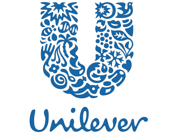
Definitely, the U in the logo represents the initial of the brand name. However, it’s not written as simple. If you take a closer look of it then see the 25 icons which are relevant to Unilever. Those icons represent the ice cream, tea leaf, jar, spoon and many more items. It shows how much you can do in just a single letter and make it alluring as well as memorable. So, the designers have nicely portrayed their creativity in just a single letter.
Wrapping up
Therefore, while crafting the logo make sure you make the best use of the design elements. Along with that creativity of the designers to include some meaningful message in the logo design is vital. It lets you engage your customer more effectively. The above list clearly defines what you can do to make your logo meaningful.
Author – Nidhi Dave is working as a content and brand strategist at ProDesigns – a graphic design company, recommending strategies to meet customers’ goals and deliver a superior user experience. She provides content leadership, ensuring that a consistent brand message is delivered to the audience.


