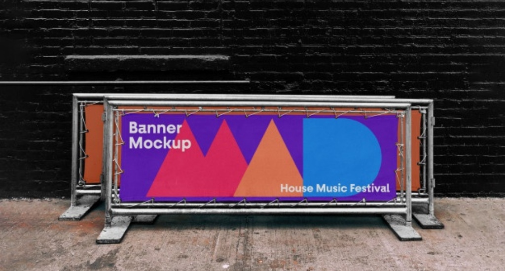
Great communication is one of the strongest assets of a brand but it is often usually neglected where we need it most. Appropriate, effective signage is important for every business, to help create a brand identity, to inform the customers of upcoming events and campaigns, and to broadcast your message to other brands and target audiences.
You must already know the significance of colours in the marketing and advertising world. Colours usually tend to set the mood everywhere and in almost everything, and different colours schemes trend each year. You probably considered these things when you were deciding your business’s logo, print material, or even your office interiors. This concept is no different when it comes to the signs and outdoor banners you display inside and outside of your business for visibility. Outdoor advertising banners are a noteworthy promotional tool and hence it is important to ensure you know how to pick the best colours for advertising signs to create a long-lasting effect on customers.
Colour Theory 101
Do you remember the time in school when you were made to learn about the colour chart during the art class? The primary colours are the ones that don’t come from other colours but are actually the sources of all secondary colours. There are three primary colours – red, yellow and blue. Now, secondary colours are those that come from combining primary colours in different proportions. For instance, red and yellow combine to give orange, yellow and blue make green and blue and red combine to give purple.
Tertiary colours, as the name suggests, are created from mixing a primary and a secondary colour. For example, blue and purple combine to make violet. Combining colours in the real world is a bit more intricate, whether with paint or printer ink. However, having a basic understanding of the relation between different types of colours is crucial to know how to use them wisely.
Colours that go well with each other are complementary colours. Usually, these are opposite to each other on the colour chart, like orange and blue. Analogous colours are three consequent hues, which means they are similar in nature.
Saturation means the intensity of a colour based on light. By reducing the saturation of a colour, it lightens and increasing the saturation darkens the colour. Similarly, tinting means adding white to a colour to make it significantly lighter and shading is adding black to make it a bit darker. These are some of the simple ways to change the appearance of a colour and it is important to understand this for your pvc banners.
Catching Customer’s Attention
The main aim for any marketing material is to be able to attract the customers’ attention. For this, you need the right colour scheme for your marketing related activities. Colour and contrast has always played a very important role in the success of a particular brand or its marketing campaigns. We are always surrounded by some of the best marketing campaigns, if you look around and pay close attention you will notice. At the same time, the colour needs to represent your brand, the feel you want to invoke in the customers and must suit your products or services. The colours that you select for your hoarding board will decide how effective they are catching the customer’s attention. For instance, a neutral colour can easily blend in with the environment. Neutral colours are white, black and different shades of brown and gray. More often than not, dark colours like navy blue can act as neutrals.
The ideal colours for outdoor roller banners and mesh banners are bright hues because it creates a unique hue. Like, a radiant yellow or a red or neon is more visible than a neutral shade. But, this doesn’t mean you only focus on bright colours and ignore neutrals. The idea is to create a balance and make use of the perfect contrast.
Colour Contrast
Have you ever realized how a colour can look different based on which colour it is paired with? For instance, putting the same shade of blue side by side on different backgrounds would change how you perceive each one. On a lighter background, it will look imminently brighter whereas on a darker background it will kind of blend in.
Similarly, what neutral colour is in the background can decide the perception of contrast and size. A small red circle within a large black circle would look significantly bigger. Whereas, on a white background, it would look smaller and dull. On top of a colour like bright orange, the read circle would not stand out. Moreover, when paired on a green background, it would look comparatively better.
Final Word
In the above three points we have discussed in detail regarding the different colour combinations that would do the magic for your outdoor advertising banners. Now, as you have a clear picture of how colours work together, you can understand why colour scheme is important when it comes to outdoor banner printing for your business. The most significant factor to consider in this situation is the text on your outdoor roller banner. You must get help from designers as they know exactly how to use colours and an impressive colour scheme to the benefit of a banner or a marketing campaign. They will guide you properly. Any colour scheme tips you get from them must be remembered for all marketing related acitivities you do because it will apply to all those marketing materials as well.
You must ensure that the colour scheme you select makes the text easy to read, especially for shoppers who are driving by or are at a greater distance. Maximum legibility comes with a brightness contrast of 75 percent of more. This means, in most outdoor banners, the colour pairing will be a dark and light hue. The success of your business relies heavily on your outdoor banners and you must take professional help to design the best outdoor advertising banners.
